Extraneous Good Information (albeit not relevant)
Sometimes when creating a slide presentation, the presenter can get a little carried away and incorporate slides that probably don’t belong, but the presenter found them and thought they would be great to share with the audience. Maybe they found some great information about a customer support survey that shows the company has stellar customer support. This is a great piece of information that must be shared with the entire organization, but if your presentation is about improving a production line with new equipment or an analysis of sales by type, it is not relevant to the point being presented and should be excluded.
Use the Audience's Language
When you create a slide, make sure you are speaking the same language as your audience. If you are talking with upper management, they will know what ROI, EBITAB and EPS are, but others in the company may not have any idea what those acronyms mean. Your slides should also use labels and titles that the audience can relate to.
Avoid Slide Clutter
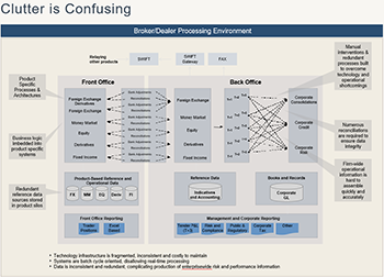
You want to make sure you don’t confuse your audience with some extraneous clutter, some conflicting information, other irrelevant information, some improper labelling, or improper chart scaling. The charts should not make your audience work too hard. Make them easy to understand. To make it even easier on them, use
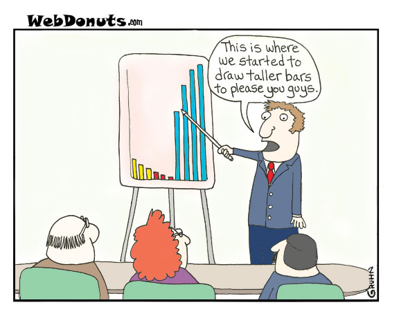
Interpretive Chart Titles. An Interpretive Chart Title is a title that provides a conclusion about what the slide is presenting, not just a description of the data. For example, if you are showing a chart on sales from one year to the next, you could says "Sales - Current Year vs Prior Year" but that does not help the audience. They would have to look at the numbers and draw their own conclusion. BUT if you labeled your chart "Current Year Sales 20% up from Prior Year" you have instantly connected with your audience what the chart is intending to show. Of course, you must be honest and not distort the truth like the image above at right. Don't show charts and bars that are not true or are irrelevant.
Use Progressive Disclosure for Complicated Charts
When you have a lot of information that needs to be presented on a single chart consider using
progressive disclosure. Progressive Disclosure is when you show a simpler chart first, describe the chart, then add an overlay of additional information, more explanation and then add another overlay and more description. Remember, the best way to make a presentation is to tell a story. Take you audience on a magical journey through your presentation, leading them to your conclusion and call to action. You are essentially leading them by the hand, spoon feeding them information so they can follow you. You want to avoid overwhelming them and progressive disclosure is the best way to accomplish this.
Conclusion
Keep your slides relevant and relatable to the audience and your objective. Avoid extraneous information that clutters up your presentation and delivery. Use Progressive Disclosure to make sure the audience is not overwhelmed with information.
For more information on presenting with charts and graphs checkout out program
Creating And Organizing Your Presentation Content This article answered the following questions:
- How to make your Charts Effective?
- How to make your slides more impactful?
- When do I use Progressive Disclosure with my Charts?
- How to avoid Extraneous irrelevant information in your presentation?
- How to use interpretative titles to help your audience understand?